
Your site might look fine on the desktop. But what happens when someone opens it on their phone? Menus get jumbled. Buttons shrink. Visitors bounce. You lose leads before they even see your offer.
According to a study, over 60% of web traffic happens on mobile devices. And Google knows it. That’s why it ranks your mobile experience before anything else.
If your website isn’t built to adapt to every screen, it’s not just underperforming. It’s costing you customers. The good news? Fixing it doesn’t mean starting over. You can make it responsive if you know what tools to use.
This quick guide breaks down what responsive design actually means. Why your business needs it. And what’s at stake if you don’t take it seriously in 2025.
What is Responsive Web Design?
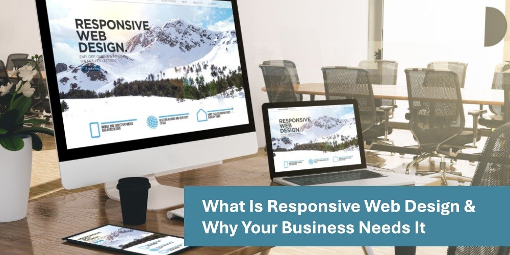
A Responsive Web Design (RWD) makes your website viewable on any screen. Whether someone visits your website on a phone, tablet, or desktop. The layout shifts and fits that specific screen without disrupting the user experience.
This is made possible thanks to tools like CSS media queries, fluid grids, and flexible images. So instead of building separate sites for each device, one website version adjusts on all of them. A professional web design & development company ensures that users no longer need to zoom to read text or try to click buttons that are too small.
A responsive design isn’t about shrinking content. It’s about prioritizing it. It makes sure that the most important stuff such as your call button, your location, your services appear exactly where people need it.
For Google, this approach is preferred. It uses a single URL, avoids duplicate content, and keeps your site search-friendly.
Enhanced User Experience Across Devices
Let’s be real, no one wants to fight with your site. If it’s hard to use on mobile, people leave. Fast.
When your design is responsive, it removes friction. Menus stay readable. Images don’t cover buttons. Text is easy on the eyes. Everything just works on any screen.
That smoother experience builds trust. It tells your visitor, “We care about details.” It makes your brand feel polished even before you speak to them.
What’s more important is that it keeps the user from leaving the webpage. The longer they stay, the more likely they are to click the call or book button on the site. A responsive design reduces bounce rates and increases time on site. And increases the chance of a sale.
Creating a responsive design helps people get what they came for without making them work for it.
Improved SEO and Search Rankings
Your site could have the best content in the world, but if it’s not mobile-friendly, Google might not even show it.
Google uses mobile-first indexing, which means it ranks you based on your mobile experience. If your mobile version is clunky, your rankings will suffer, no matter how great your desktop version looks. That’s the first thing quality SEO services will address for your website.
Responsive design techniques solves that. It offers a consistent experience across devices, all on one URL. That keeps your content clean, crawlable, and optimized for search engines.
Plus, you avoid issues like duplicate content (from separate mobile sites), slow loading times, and messy redirects.
Responsive websites score better on Core Web Vitals especially new metrics like INP (Interaction to Next Paint). And better scores mean better visibility.
In short: if you want to rank well, responsiveness is no longer optional.
Cost-Effectiveness and Maintenance Efficiency
Running two or three separate versions of your site? That’s expensive. Every update, every image change, every bug fix done multiple times. It drains time, money, and energy.
Responsive design ends that headache. You manage one website. One place to update. One set of analytics. One bill.
It saves you money in the long run because you’re not redesigning for every new device or screen size.
And when something breaks? You fix it once. That simplicity helps your team move faster and focus on what actually matters such as converting leads.
If you’re using a drag-and-drop builder that’s struggling to keep up, it’s not your fault. Most of them weren’t built for full responsiveness. But the right setup can change that without switching platforms.
Increased Mobile Traffic and Conversion Rates
More than half your visitors are likely on their phones. That means mobile is where first impressions happen and where sales begin.
If your site loads slowly or looks broken, those visitors won’t wait. They’ll bounce. Worse, they may never come back.
A responsive site fixes this. It loads faster. It’s easier to read. CTAs are visible, tap targets are clear, and forms are easier to fill out on small screens.
All of this directly impacts your conversion rates. Even small UI/UX design fixes like a sticky “Call Now” button or removing unnecessary carousels can drive more action.
And here’s the kicker: even though desktop still converts slightly better, mobile traffic drives the most visits. That means a better mobile experience creates more chances to win.
Additional Business Benefits
Responsive design doesn’t just solve today’s problems. It protects you from tomorrow’s.
New phone model launches? Your site’s ready. Foldable screens? Handled. Tablet view? Covered. It’s future-proof by design.
You also gain cleaner data. With one site, you don’t need to compare mobile-site analytics vs desktop. Everything’s in one place so you can spot what’s working and double down.
RWD also integrates better with modern marketing strategies. Whether it’s local SEO, paid ads, or social campaigns your landing pages stay consistent across devices.
And when you’re ready to grow, your site doesn’t hold you back. It grows with you. That means fewer rebuilds, fewer redesigns, and fewer headaches.
Conclusion
Here’s the truth: if your website isn’t responsive, it’s not just outdated. It’s costing your business dollars.
Today’s visitors expect mobile-friendly by default. So does Google. And if they don’t get it? They bounce. They choose someone else.
Responsive Web Design isn’t a nice-to-have anymore. It’s what wins you a customer or you’re losing one to a competitor who’s already optimized.
The fix doesn’t have to be complex. It just has to work. Start by getting your layout to flex, your buttons to behave, and your content to load fast.
Want help turning your site into something that works everywhere? Contact our web development experts today.